Developing a UI with Vue, Part 3: Mobile Navigation
Covering everything from animated burger icons with SCSS to Vue's v-directives and lifecycle hooks. Join me 🐖
I'm a UI Developer from New Jersey, USA. I love everything front-end, from design to implementation, and hope to share my experiences in development here.
Making mobile navigation has always been fun for me, no matter how many times I do it. I don't know why, but something about designing a menu button and toggling the drawer navigation on and off screen has never stopped feeling like ✨ magic ✨ to me.
We left off laying the groundwork for our app in my last post, so let's begin by digging into the mobile Navigation.vue component.
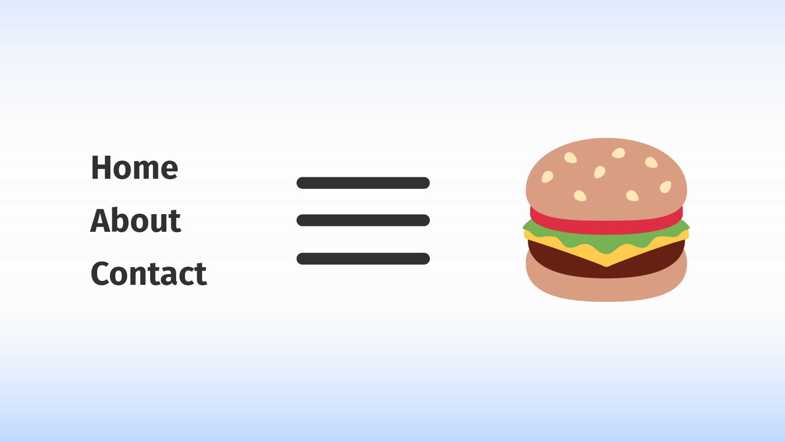
Adding the burger 🍔
When visiting most websites you'll often see menus, especially on mobile, become hidden behind a toggle button that looks like three lines stacked on top of one another. Semantically, these three lines represent a list of items like you'd see in any navigation menu. And as you might guess, they sorta look like a cheeseburger. See how similar they are?
We'll start by marking up the burger in HTML, where we'll be using a two-line approach for simplicity:
  <button class="burger" aria-label="Toggle Menu">
    <div class="line line-1"></div>
    <div class="line line-2"></div>
  </button>
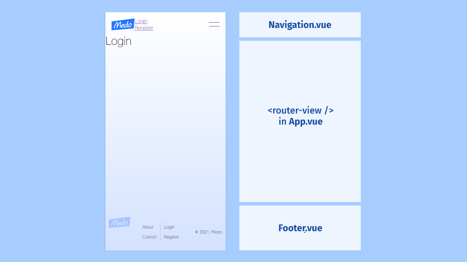
And then we'll do the following:
- Place the burger markup right inside of our
<nav>element. - Wrap our
<ul>in a container element. We'll use this to manipulate its style and behavior later on. - Add an
<img>element as the first child of our nav. We'll link the logo as oursrcattribute.
<template>
  <nav id="nav" role="navigation" aria-label="Main Navigation">
    <img id="logo" src="../../assets/logo.png" width="82" />
    <div class="list-container">
      <ul>
        <li>
          <router-link to="/">Login</router-link>
        </li>
        <li>
          <router-link to="/register">Register</router-link>
        </li>
      </ul>
    </div>
    <button class="burger" aria-label="Mobile Navigation Toggle Button">
      <div class="line line-1"></div>
      <div class="line line-2"></div>
    </button>
  </nav>
</template>
Once we have the burger in our template, we can style it:
- Begin by removing default button styles and setting the button dimensions.
- Define the base styles for each line in our burger (we have two of them). They're each going to be the full width of the button, but only a couple of pixels thick, separated by a margin above and below.
- The
&.opensyntax is a SCSS selector that styles the element when it has both classes. So when theburgerclass element also contains theopenclass, the lines are going to reposition themselves to form an ❌.
button.burger {
  border: none;
  background: none;
  width: 38px;
  height: 40px;
  cursor: pointer;
  z-index: 100;
  .line {
    width: 100%;
    height: 2px;
    border-radius: 20px;
    background: $gray200;
    margin: 12px 0;
    transition: all 0.4s ease-out;
  }
  &.open {
    .line-1 {
      transform: translateY(7px) rotate(45deg);
    }
    .line-2 {
      transform: translateY(-7px) rotate(-45deg);
    }
  }
}
Tip: I perfected the transform positioning by placing a border on the button and making edits in Chrome's Dev Tools. It's much easier to do there than to work directly in the code editor.
Once we're finished, we'll end up with something like this 👇
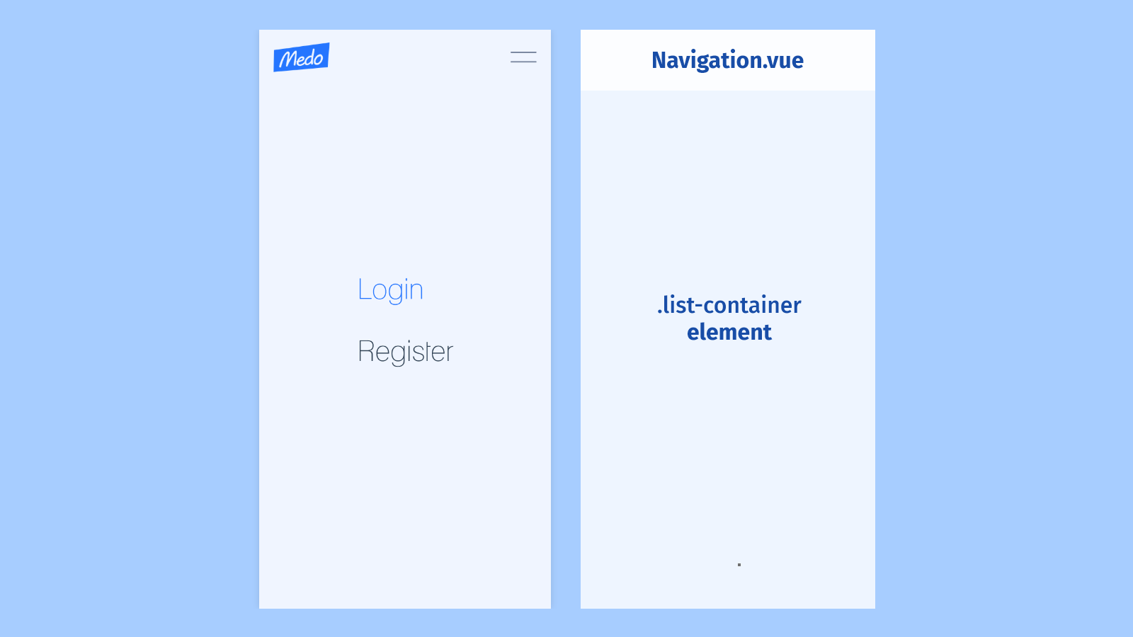
Styling the navigation menu 🗺️
In order to move on, we'll want to begin styling that .list-container class we wrapped around our <ul> element:
  .list-container {
    display: none;
    opacity: 0;
    height: 100vh;
    width: 100%;
    position: absolute;
    left: 0;
    top: 0;
    background: $blue100;
    z-index: 99;
    transition: all 0.4s ease-out;
    &.open {
      @include flex(row, center, center);
      opacity: 1;
    }
  }
Let's break down what this is doing exactly:
displayandopacityset a hidden default stateheightandwidthfill the user's viewportposition: absoluteis removing the element from the flow of the pageleftandtopdo something different depending on thepositionproperty. In our case, these properties set the distance between the element and the closest parent withrelativepositioning. Ours is the root#appelement. Along withheightandwidth, these properties are what make our mobile navigation fill the user's screen.- Finally,
z-indexbrings the element to the forefront of our user's experience. Thetransitionproperty is for later when we're toggling between classes and we want a smooth visual effect.
I also want to point out that Vue Router gives us an "active" class, which we'll use to style the currently selected route:
a {
  text-decoration: none;
  color: inherit;
  &.router-link-exact-active {
    color: $blue500;
  }
}
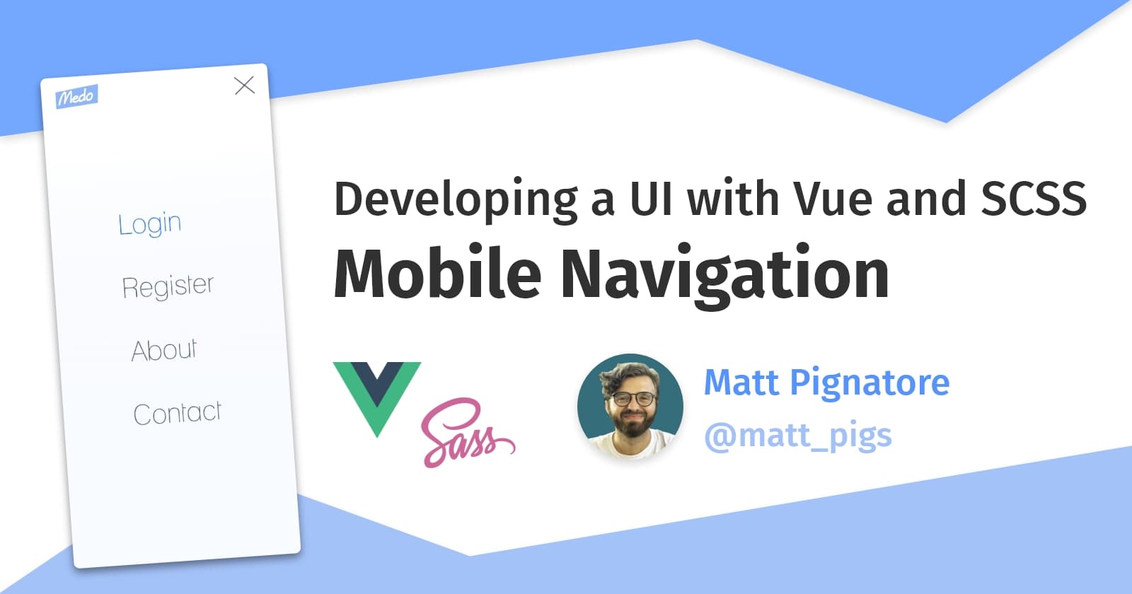
With the addition of some base styles applied to our menu items (I used flexbox to center the div, everybody), our .list-container menu will appear to the user as you see below; the parent <nav> element stays in the forefront using z-index so that we can still access the toggle.
Where Vue comes in 💚
In React we have state: a set of properties which control a component's behavior. State is typically stored and updated with the useState hook, or alternatively, within this.state in class-based components.
In Vue, state is represented with the data object (it's really a function that returns an object, but you get it). Once we begin adding properties, Vue "pulls [this object] into its reactivity system and stores it on the component instance as $data." That's straight from the docs.
If you're confused like I was about the $ prefixes in the Vue ecosystem, this excerpt from the Vue documentation might help:
Vue uses a $ prefix when exposing its own built-in APIs via the component instance. It also reserves the prefix _ for internal properties.
This is why you might see similar references like $store or $route in Vue components. They're just special Vue APIs that help you do stuff 😇
Vue's data and method options
The only property our Navigation component needs is one that tracks the menu's open status. We'll initialize this property with a boolean value of false and call it menuOpen.
<script>
export default {
  name: 'Navigation',
  data() {
    return {
      menuOpen: false,
    }
  },
</script>
Now, we need to handle the toggling of this value. We'll do this by adding a methods options to our component instance and create our first Vue method!
Vue makes it easier for us to reference data values by binding this for methods, so and we need to do is define handleToggleMenu() and use the logical NOT operator to flip the boolean value of menuOpen.
<script>
export default {
  name: 'Navigation',
  data() {
    return {
      menuOpen: false,
  },
  methods: {
    handleToggleMenu() {
      this.menuOpen = !this.menuOpen
    },
  },
}
</script>
Using v-directives in the template
We're going to bring this component full circle by helping our state and methods define component style and behavior, thus driving the user experience. We can do that by turning to v-directives, in particular v-bind.
Let's focus first on the .list-container element. In addition to the normal class attribute we'd see in typical HTML, we can bind class values with the syntax below.
<div class="navigation-wrapper" v-bind:class="{ open: menuOpen }">
  <ul>
    <li>
      <router-link to="/">Login</router-link>
    </li>
    <li>
      <router-link to="/register">Register</router-link>
    </li>
  </ul>
</div>
First, as someone who came to Vue from React, I know the string syntax can be a little disorienting at first. I'm used to using brackets in JSX (i.e. className={}) and inserting some conditional logic. However the class binding acts in a very interesting way.
With v-bind:class (or :class for short), what Vue does is measure the truthiness of a property's value inside of the object. So in this example:
- We provide an object -
{ open: menuOpen }. - Vue sees the
openproperty and its corresponding valuemenuOpen - If
menuOpenis truthy,openis applied as a class, otherwise nothing happens.
Note: It's also important to point out that Vue makes it so that all properties are made available from within a component's template, so we're able to reference menuOpen and handleToggleMenu with ease.
We can go ahead and replicate this functionality on the burger button element with the addition of the @click property.
<button
  aria-label="Mobile Navigation Button"
  class="burger"
  v-bind:class="{ open: menuOpen }"
  @click="handleToggleMenu"
>
  <div class="line line-1"></div>
  <div class="line line-2"></div>
</button>
Similar to React's onClick event handler, we're able to pass a function to the @click handler in order to handle the user's action. This is just one of Vue's many event handlers, including @scroll, @keyup, @keydown, and even @submit. Vue also has event modifiers which are very cool and worth checking out.
When we click the burger button now, our menu toggles on and off screen like it should!
Cascading animation with SCSS 💅
There's one last thing I'd like to do, and that's apply a cascading effect to each individual list item using a @keyframes animation. We could accomplish this by hard coding some classes in CSS, but SCSS gives us a much better way.
Looping with SCSS
SCSS gives us a very easy way to generate as many classes as we'd like with just a few lines of code. We can do this by defining a for loop inside of our <li> selector.
li {
  @for $i from 1 through 8 {
    &.slide-in-#{$i} {
      animation: nav-items-enter 500ms ease #{$i / 12}s 1 forwards;
    }
  }
}
Let's break this down...
- We set a variable to loop over and use the
&.[class-name]syntax in order to create classes for<li>tags. - We use the variable we're looping with directly within the class names. This way, we can differentiate between each class. This loop is going to generate
.slide-in-1,.slide-in-2,.slide-in-3, and so on. - The cascade comes in when setting our element's delay, so that each consecutive class is scheduled to begin animating at slightly later times than the last. The first element comes in at
1/12s, then next at2/12s, then3/12s. You get it 😉
But wait. How do we apply these classes? We could hard code them into our HTML template. But this is the perfect time to introduce lifecycle hooks in Vue.
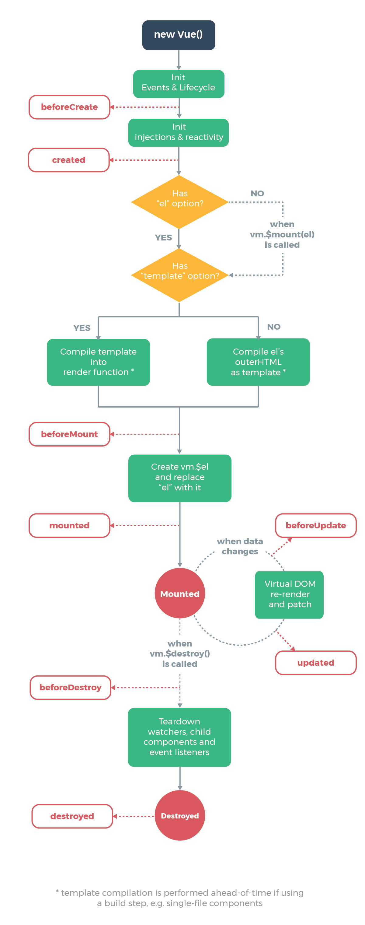
Vue's lifecycle hooks ⚓
The lifecycle of a component is an important thing to consider when developing with Vue. Lifecycle hooks give us windows into moments of time for a component; from when it's created and mounted to the DOM, to when it's updated or removed from view completely.
The below diagram from the official Vue.js documentation may make the component lifecycle more clear:
So just like we have for data() and methods(), we can add the mounted() hook to our component instance and write some good old JavaScript to loop over each of our nav items.
<script>
export default {
  name: 'Navigation',
  data() {
    return {
      menuOpen: false,
    }
  },
  mounted() {
    const navItems = document.querySelectorAll('.list-container li')
    navItems.forEach((item, index) => {
      item.classList.add(`slide-in-${index + 1}`)
    })
  },
  methods: {
    handleToggleMenu() {
      this.menuOpen = !this.menuOpen
    },
  },
}
</script>
Tip: We don't even really need the mounted() method to apply those classes. I just wanted to use a lifecycle hook! Alternatively, we can just use the CSS :nth-child() selector and loop through that, like this 👇
li {
  @for $i from 1 through 8 {
    &:nth-child(#{$i}) {
      animation: nav-items-enter 500ms ease #{$i / 12}s 1 forwards;
    }
  }
}
And viola! We have a mobile menu that toggles, and a nice little cascading animation effect for the menu items as well 🥳
Next up, I'm gonna be building custom input and button components. Hope to see you there 👋