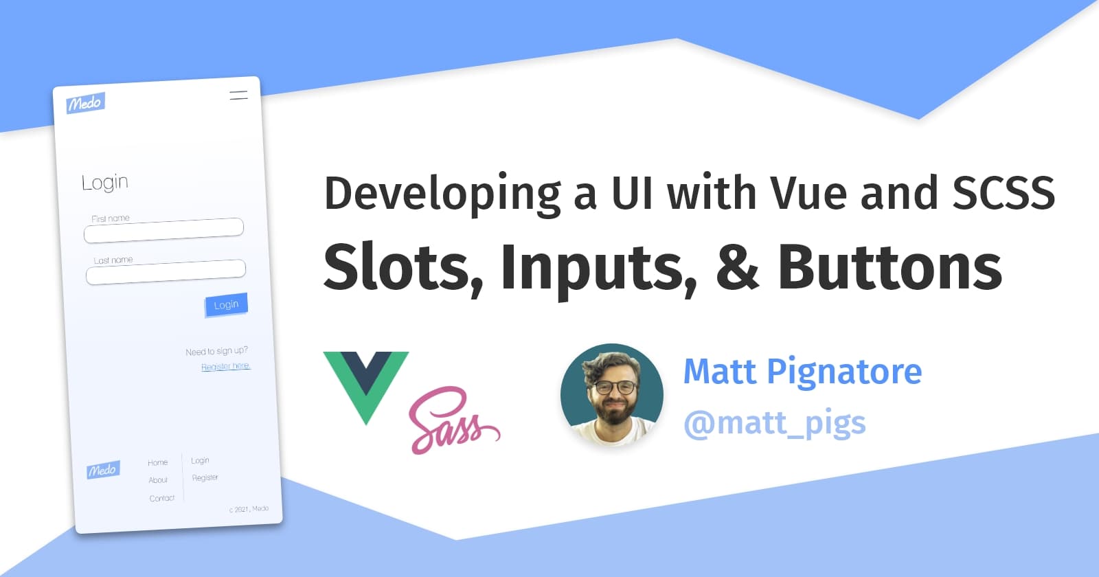
Developing a UI with Vue, Part 4: Slots, Inputs, and Buttons
We'll be going over how to create reusable components in Vue.js using slots, props, v-model and more to get the job done. 👍
I'm a UI Developer from New Jersey, USA. I love everything front-end, from design to implementation, and hope to share my experiences in development here.
In Part 3, we built our Vue app's mobile navigation component. While that was useful, Navigation.vue isn't a component we'll necessarily be reusing anywhere else in our interface. Now, we're going to begin learning how to create dynamic layouts as well as input and button components that we can reuse anywhere across our UI.
If you're interested in following along or taking a closer look at the code, feel free to check out the app's Github repo, or you can view the live app that I deployed in just a couple of minutes using Netlify. 😊
Let's get started...
Building an input component
Many of the components we create for this UI are going to be reused so often that we'll be better off defining them globally, rather than meticulously importing them into every parent component we need them in.
Vue 3 actually allows us to do this pretty easily in main.js where the app gets mounted. Let's go ahead and create BaseInput.vue inside of components/global/ and add it to our app before the mount. I'd recommend doing this for highly common components like inputs and buttons, but don't go overboard. 🚢
// globally-defined components 🎉
app.component('BaseInput', BaseInput)

// followed by...
app.use(store).use(router).mount('#app')
Vue template syntax
The template syntax in Vue allows us to insert dynamic values into our HTML markup. Below, the input component template is being generated with a dynamic label value using mustache tags, or {{ }}.
<!-- BaseInput.vue -->

<template>
  <label class="input-wrapper">
    {{ label }}
    <input
      :type="type"
      :placeholder="placeholder"
      :value="modelValue"
      @input="$emit('update:modelValue', $event.target.value)"
    />
  </label>
</template>
That label value is one of many props that helps this component achieve reusability. Along with the data-bound values of type, value, and placeholder (v-bind, or : for short), these props make our component dynamic because they allows us to redefine those values on every occurrence of the component.
Vue props
In all modern frameworks, props define the content of our components (often using strings, numbers, booleans, or objects as data sources). They can also define the functionality of our components (we can pass functions/handlers too 😎).
On first appearance, props will look just like HTML attributes; however, under the hood they're a core piece of what sets a framework apart from plain old HTML, CSS, and JavaScript.
In Vue, component props must be defined in the export object. We can do this by defining them as strings in an array, or as objects with some configuration options.
// props declared as strings in an array
export default {
  name: 'BaseInput',
  props: ['modelValue', 'label', 'placeholder', 'type'],
}

// props declared as objects
export default {
    name: 'BaseInput',
    props: {
        modelValue: {
            type: String,
            default: '',
        },
        placeholder: {
            type: String,
            default: 'Placeholder text...',
        },
        type: {
            type: String,
            default: 'text',
        },
    },
}
I always prefer the way of objects because I like setting defaults. Plus, I feel secure having some restraints around type setting. It's no TypeScript, but it's better than nothing!
What's $emit?
Above, you might've noticed this weird looking line on BaseInput.vue:
@input="$emit('update:modelValue', $event.target.value)"
This is a custom event handler, just like the @click event we used in our navigation toggle in my last post in this series.
The $emit function inside of that handler allows us to send events up the component tree, and it takes two arguments:
- The listener that gets defined in the parent component,
'update:modelValue', - The value we're sending up, which in our case is located on the
$eventobject (our input value).
Later when we get to the v-model directive, you'll see where the emit value is going.
Now that we've told our component to be on the lookout for these props, and we're emitting the input value back up to the parent, we can finally use the component in Login.vue and begin passing props in.
<!-- Login.vue -->

<template>
  <h1>Login</h1>
    <form>
      <BaseInput
        placeholder="Enter email..."
        label="Email"
        v-model="email"
       />
       <BaseInput
         placeholder="Enter password..."
         label="Password"
         v-model="password"
         type="password"
       />
    </form>
</template>

<script>
export default {
  name: 'Login',
  data() {
    return {
      email: '',
      password: '',
    }
  },
}
</script>
Let's break down each of the props:
placeholder- Because we used data-binding on the HTML placeholder attribute inBaseInput.vue, any string value we pass in here as a prop will fill the input's placeholder value.label- Similar toplaceholder, except that it doesn't end up an HTML attribute; it gets rendered to the user as an input label in the component's template.type- We set a default value of "text" inBaseInput.vue, so this value is technically not needed if we want to use a standard text input. However, passing in strings like "password" or "number" allow us to easily change the type of input we'd like to render.v-model- Alright, this deserves its own section...
V-model
Vue's v-model directive applies two-way data binding on user inputs (text, select, checkbox, etc.). It's described in the Vue docs as "syntax sugar" (yum 🍫), and is actually shorthand for something that we could just write ourselves.
<BaseInput v-model="email" />

<!-- is the same as... -->

<BaseInput
  :modelValue="email"
  @update:modelValue="email = $event"
/>
Earlier in BaseInput.vue ,we used $emit to send the input value up to the parent component. Now we are:
- Passing the
modelValueprop down to our input component, setting it equal toemail - Applying the
@updatelistener so that every time the input changes (and emits), we're setting the input value equal to themodelValuewe've provided to the input (email or password, in our case).
Note: Writing the v-model longhand syntax on inputs in Vue 3 is a bit different than Vue 2, and it took me a while to figure that out. If you're still on v2, go check out the docs that lay these changes out pretty clearly.
And with that, our text input component is finished! But unfortunately our layout's spacing is not in the best shape.
It's only CSS that we need, but let's explore how to create a styled layout using slots.
Introducing slots in Vue
Slots allow us to create parent components that take dynamic children. In addition to props, they're a great way to improve a component's reusability, so now we're going to use them to tighten up our mobile layout.
If you're familiar with React, you might know the children prop and how it allows you to compose components meant to contain dynamic child elements. This is basically the equivalent in Vue:
<template>
    <section>
        <slot /> <!-- or <slot></slot> -->
    </section>
</template>
The above is an important use case for when we're making button or card components with a single location to place children. But slots come with some deeper functionality.
Named slots
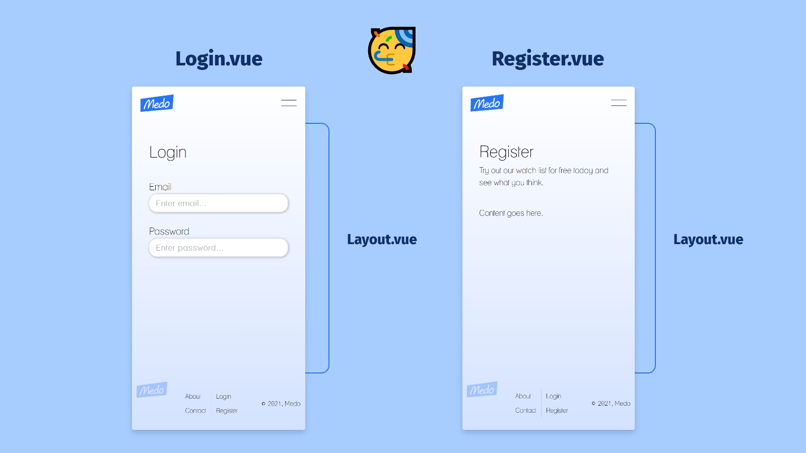
Named slots allow us to use multiple slots, and it's really as simple as it sounds. By using the name attribute, we can be more targeted in our template markup. This is what we're going to use in our new Layout.vue component, which lives in components/layout/.
<!-- Layout.vue -->

<template>
    <div class="layout">
    <div class="header-wrapper">
      <slot name="header" />
    </div>
    <section>
      <slot name="content" />
    </section>
  </div>
</template>
The styling to this layout is minimal and is mostly applied for spacing.
div.layout {
  max-width: 80%;
  margin: 0 auto;
  .header-wrapper {
    margin-top: $space8;
    margin-bottom: $space7;
  }
}
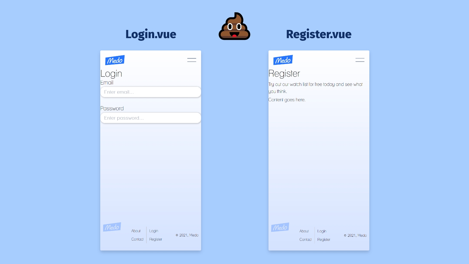
When we want to use this component on the Login page, we'll just need to slot in our content with template tags and the v-slot directive, following by a colon and the named slot we're targeting:
<!-- Login.vue -->

<Layout>
    <template v-slot:header>
        <h1>Login</h1>
  </template>
  <template v-slot:content>
        <form>
            <!-- Form elements go here -->
        </form>
  </template>
</Layout>
Then we can do the exact same thing in our Register view as well:
<!-- Register.vue -->

<Layout>
    <template v-slot:header>
        <h1>Register</h1>
  </template>
  <template v-slot:content>
        <form>
            <!-- Multi-step form elements go here -->
        </form>
  </template>
</Layout>
Beautiful! It's amazing what a little bit of spacing can do. 🌺
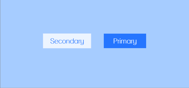
Building a button component
Finally, we're going to build out a button that we can use on both Login.vue and Register.vue. We'll call it BaseButton.vue and it's going to receive two props that'll handle functionality and appearance.
<template>
  <button
    :variant="variant"
    @click="onClick"
    :class="handledVariant"
  >
    <slot />
  </button>
</template>
variant- The variant will determine the button's appearance. In this case, we just need to handle two values passed in: "primary" and "secondary."@click- The click handler will handle the button's functionality. Providing this as a prop allows us to pass in any function we want from the parent.
The class-binding with value, handledVariant, is doing something a bit different...
Computed properties
Instead of referencing a prop, handledVariant is actually a computed property that we've defined on the component instance. Just like methods and data(), computed is an option that we can include in our export. Its purpose is to help us keep programming logic out of our HTML templates.
<script>
    data() {
        return {}
    },
    props: {...},
    methods: {...},
    computed: {
      handledVariant() {
        switch (this.variant) {
          case "primary":
            return "primary";
          case "secondary":
            return "secondary";
          default:
            return "primary";
      }
    },
  },
</script>
Above, we're using a switch statement that returns a string depending on the variant value passed in. That string gets applied as the component's class because we've applied class binding (:class) on the component.
I've also set up a small animation when the component first renders using transform: skew() and box-shadow:
button {
  font-family: inherit;
  font-size: 1.8rem;
  font-weight: 900;
  padding: 8px 18px;
  border: none;
  cursor: pointer;
  margin: $space4 0;
  transform: skew(-3deg, -3deg);
  &.primary {
    background: $blue500;
    color: $white;
    padding: 8px 24px;
    transform: skew(0deg, 0deg) translateX(0px);
    box-shadow: 0px 0px 1px 0px rgba($blue500, 0);
    animation: primary 500ms ease 0.5s 1 forwards;
  }
  &.secondary {
    background: rgba(255, 255, 255, 0.8);
    border: 1px solid $blue200;
    color: $blue500;
    transform: skew(0deg, 0deg) translateX(0px);
    box-shadow: 0px 0px 1px 0px rgba($black, 0);
    animation: secondary 500ms ease 0.5s 1 forwards;
  }
}
Now when we want to render BaseButton.vue, it's this simple. 👇
<!-- primary style -->
<BaseButton
  :variant="primary"
  :onClick="() => console.log('do something!')"
>
  Continue
<BaseButton>

<!-- secondary style -->
<BaseButton
  :variant="secondary"
  :onClick="() => console.log('do something else!')"
>
  Go back
<BaseButton>
Event modifiers
Let's finish out this Login.vue component by running a console.log when the form is submitted.
<template>
  <Layout>
    <template v-slot:header>
      <h1>Login</h1>
    </template>
    <template v-slot:content>
      <form @submit.prevent="handleSubmit">
        <!-- form inputs and buttons go here -->
      </form>
    </template>
  </Layout>
</template>
We've attached the @submit handler to our form, which gets triggered every time the user clicks the first button (which defaults to type "submit" when placed inside of a form).
Now we just need to make sure our state values, email and password, are getting captured. We can do that by writing a handleSubmit function and using console.log to see the results.
<script>
export default {
  methods: {
    handleSubmit(e) {
      e.preventDefault();
      console.log(this.email, this.password);
      // view the entire data() object with `this.$data`
    }
  }
}
</script>
But we actually don't need the e.preventDefault() part. Vue handles preventing the page reload for us when we include the .prevent modifier on the submit handler. It also provides a lot of other event modifiers that are all similarly helpful.
And we're done. You can scroll down to view our finalized Login.vue component. 🙌
In the next installment, we'll be focused on building a multi-step form for user registration. See you then!
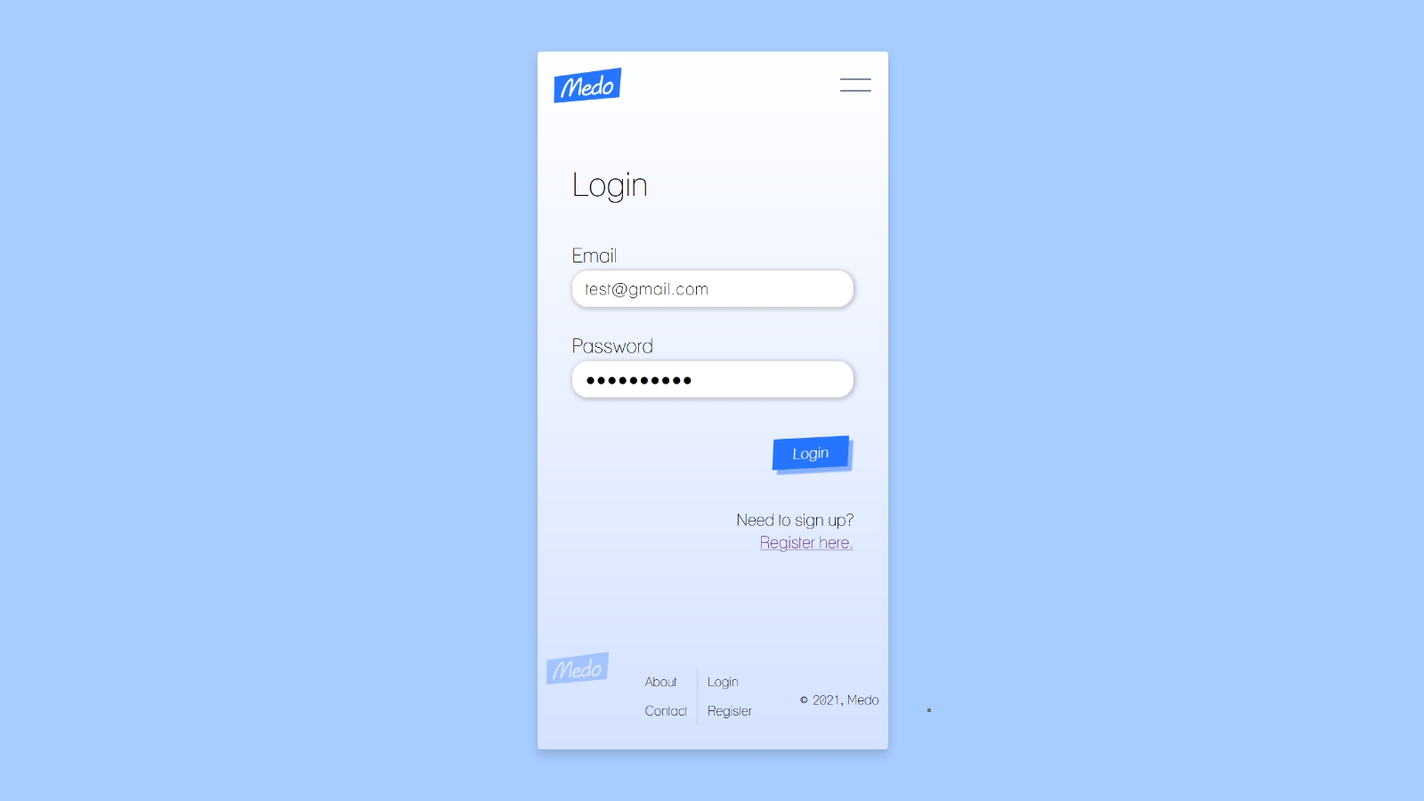
<template>
  <Layout>
    <template v-slot:header>
      <h1>Login</h1>
    </template>
    <template v-slot:content>
      <form @submit.prevent="handleSubmit">
        <BaseInput
          placeholder="Enter email..."
          label="Email"
          v-model="email"
        />
        <BaseInput
          placeholder="Enter password..."
          label="Password"
          v-model="password"
          type="password"
        />
        <div class="right-alignment">
          <BaseButton>Login</BaseButton>
          <aside class="right-alignment">
            <p>Need to sign up?</p>
            <router-link to="/register">Register here.</router-link>
          </aside>
        </div>
      </form>
    </template>
  </Layout>
</template>

<script>
export default {
  name: 'Login',
  data() {
    return {
      email: '',
      password: '',
    }
  },
  methods: {
    handleSubmit() {
      console.log(this.$data);
    }
  }
}
</script>

<style lang="scss" scoped>
aside.right-alignment {
  text-align: right;
  & > div {
    margin-top: $space6;
  }
}
</style>